7 Comparing data
The first part of this chapter guides you through an ANOVA (analysis of variance) using the iris dataset, while the second part showcases a correlation analysis using two variables from the dataset used to create the 2011 Output Area Classification (2011OAC). Create a new R project for this chapter and create a new RMarkdown document to replicate the analysis in this document and a separate RMarkdown document to work on the exercises.
As many of the functions used in the analyses below are part of the oldest libraries developed for R, they have not been developed to be easily compatible with the Tidyverse and the %>% operator. Fortunately, the magrittr library (loaded above) does not only define the %>% operator seen so far, but also the exposition pipe operator %$%, which exposes the columns of the data.frame on the left of the operator to the expression on the right of the operator. That is, %$% allows to refer to the column of the data.frame directly in the subsequent expression. As such, the lines below expose the column Petal.Length of the data.frame iris and to pass it on to the mean function using different approaches, but they are all equivalent in their outcome.
# Classic R approach
mean(iris$Petal.Length)
## [1] 3.758## [1] 3.758## [1] 3.7587.1 Independent T-test
The Independent T-test is a simple statistical test that can be used to compare two independent groups based on the same attribute. For instance, you might want to compare the versicolor and virginica species of iris based on their petal length, to assess if they are different. The boxplot below indicates that the two species seem to have rather different petal length, but is the difference statistically significant? That is the type of question that we can answer using the Independent T-test.
versicolor_and_virginica <-
  iris %>%
  filter(
    Species == "versicolor" | Species == "virginica"
  ) %>%
  select(Species, Petal.Length)

versicolor_and_virginica %>%
  ggplot(
    aes(
      x = Species,
      y = Petal.Length
    )
  ) +
  geom_boxplot() +
  theme_bw()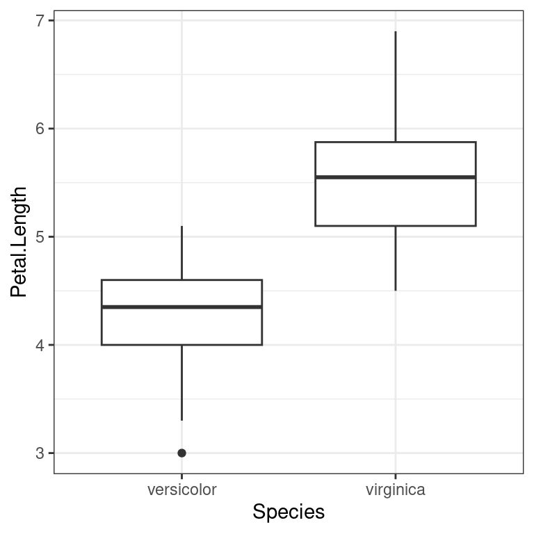
The Independent T-test can be seen as a special version of the general linear model. In the general linear model, observation \(i\) can be predicted by a \(model\) (predictors) if we allow for some amount of error.
\[outcome_i = (model) + error_i \]
For the Independent T-test, the predictor is the the group average for the outcome, which is equal to our outcome if we allow for some amount of error.
\[outcome_i = (group\ mean) + error_i \]
Calculating the average per group can be seen as an extremely simplified version of machine learning. The observed values are used to “learn” a model, which in this case is their average. The “model” is as simple as a table with the average for each group. As such, we can “learn” a model for the petal length of versicolor and virginica iris, as shown below. If we then want to “predict” the petal length for a new flower, we can simply look at the species and return the related average for that species. For instance, our “prediction” for a new versicolor iris will be 4.26.
avg_petal_length_ver_and_vir <-
  versicolor_and_virginica %>%
  group_by(Species) %>%
  summarise(
    avg_petal_length = mean(Petal.Length)
  )

avg_petal_length_ver_and_vir %>%
kable()| Species | avg_petal_length |
|---|---|
| versicolor | 4.260 |
| virginica | 5.552 |
To simplify, the Independent Test crates such a model and then estimates how the averages compare to each other and the standard deviations of the two groups to be able to say whether the two groups are the same or different. However, for such an analysis to be meaningful, the means and standard deviations must be representative of the distributions. As such, the values for each of the two groups should be normally distributed. We can test that with two Shapiro–Wilk tests. As shown below, both tests are not significant, which indicates that both groups have normally distributed values.
versicolor_and_virginica %>%
  filter(Species == "versicolor") %>%
  pull(Petal.Length) %>%
  shapiro.test()
##
## Shapiro-Wilk normality test
##
## data: .
## W = 0.966, p-value = 0.1585
versicolor_and_virginica %>%
  filter(Species == "virginica") %>%
  pull(Petal.Length) %>%
  shapiro.test()
##
## Shapiro-Wilk normality test
##
## data: .
## W = 0.96219, p-value = 0.1098We can thus run the Independent test. As there are 50 flowers for each species it is safer to set the significance threshold to 0.01. The result object contains a series of values which can be of interest to understand the model. In our case, we focus on p-value, which in this case is estimated as p-value < 2.2e-16. As the p-value is lower than 0.01, the test is significant. Thus, the group means are different.
t_test__ver_and_vir##
## Welch Two Sample t-test
##
## data: Petal.Length by Species
## t = -12.604, df = 95.57, p-value < 2.2e-16
## alternative hypothesis: true difference in means between group versicolor and group virginica is not equal to 0
## 95 percent confidence interval:
## -1.49549 -1.08851
## sample estimates:
## mean in group versicolor mean in group virginica
## 4.260 5.552We can report the result of the Independent test as:
- t(95.57) = -12.6, p < 0.01
The Independent T-test result object t_test__ver_and_vir also includes the standard error, which is used a measure of the quality (i.e., fitness) of the model compared to the data on which it has been created (i.e., fitted or “learn”).
t_test__ver_and_vir %$%
  stderr
## [1] 0.1025089The calculations of the standard error are a bit complicated, but they relate to another extremely common measure, which is the residual (also known as, error), which is the difference between the observed value and the model. Throughout statistics, machine learning and artificial intelligence, it is very common to use the Sum of the Squares of the Residuals (SSR) or the Mean of the Squares of the Error (MSE) as measures of model quality.
For a simple model such as the one used by the Independent T-test, we can quickly calculate those two values as follows. Join the table with the table containing the averages calculated above. Calculate the residuals (also known as, errors) as the difference between the observed value and the average, as well as the squares of those values. Finally, calculate the sum and average aggregation.
# Join and calculate the residuals
residuals_ver_and_vir <-
  versicolor_and_virginica %>%
  left_join(avg_petal_length_ver_and_vir) %>%
  mutate(
    residual = Petal.Length - avg_petal_length
  ) %>%
  mutate(
    sq_residual = residual^2
  )
## Joining with `by = join_by(Species)`
# A quick look at the table created above
residuals_ver_and_vir %>%
  group_by(Species) %>%
  slice_head(n=3) %>%
kable()| Species | Petal.Length | avg_petal_length | residual | sq_residual |
|---|---|---|---|---|
| versicolor | 4.7 | 4.260 | 0.440 | 0.193600 |
| versicolor | 4.5 | 4.260 | 0.240 | 0.057600 |
| versicolor | 4.9 | 4.260 | 0.640 | 0.409600 |
| virginica | 6.0 | 5.552 | 0.448 | 0.200704 |
| virginica | 5.1 | 5.552 | -0.452 | 0.204304 |
| virginica | 5.9 | 5.552 | 0.348 | 0.121104 |
| ssr | mse |
|---|---|
| 25.7448 | 0.257448 |
7.2 ANOVA
The ANOVA (analysis of variance) tests whether the values of a variable (e.g., length of the petal) are on average different for multiple different groups (e.g., different species of iris). ANOVA has been developed as a generalised version of the Independent T-test, which has the same objective but allows to test only two groups.
The ANOVA test has the following assumptions:
- normally distributed values in groups
- especially if groups have different sizes
- homogeneity of variance of values in groups
- if groups have different sizes
- independence of groups
7.2.1 ANOVA example
The example seen in the lecture illustrates how ANOVA can be used to verify that the three different species of iris in the iris dataset have different petal length.
iris %>%
  ggplot(
    aes(
      x = Species,
      y = Petal.Length
    )
  ) +
  geom_boxplot() +
  theme_bw()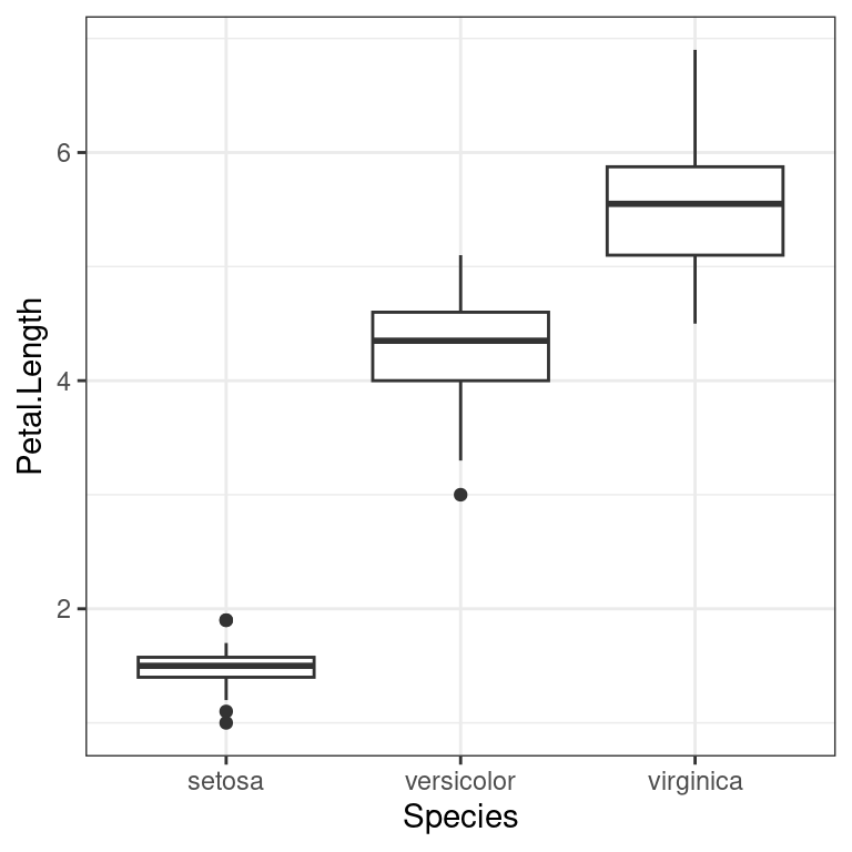
As the groups are of the same size, there is no need to test for the homogeneity of variance. Furthermore, the groups come from different species of flowers, so there is no need to test the independence of the values. The only assumption that needs testing is whether the values in the three groups are normally distributed. As there are 50 flowers per species, we can set the significance threshold to 0.01.
We already run two Shapiro–Wilk tests for the Independent T-test above. The Shapiro–Wilk test for the iris species setosa is also not significant, which indicates that all three groups have normally distributed values.
##
##  Shapiro-Wilk normality test
##
## data:  .
## W = 0.95498, p-value = 0.05481
We can thus conduct the ANOVA test using the function aov, and the function summary to obtain the summary of the results of the test.
# Classic R coding approach (not using %$%)
# iris_anova <- aov(Petal.Length ~ Species, data = iris)
# summary(iris_anova)
iris %$%
aov(Petal.Length ~ Species) %>%
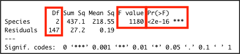
summary()## Df Sum Sq Mean Sq F value Pr(>F)
## Species 2 437.1 218.55 1180 <2e-16 ***
## Residuals 147 27.2 0.19
## ---
## Signif. codes: 0 '***' 0.001 '**' 0.01 '*' 0.05 '.' 0.1 ' ' 1The difference is significant F(2, 147) = 1180.16, p < .01. Also, note how the the output above contains a row for the Residuals with a related value for the column Sum Sq, which is the SSR value for the simple model used to calculate the ANOVA statistics.
The image below highlights the important values in the output: the significance value Pr(>F); the F-statistic value F value; and the two degrees of freedom values for the F-statistic in the Df column.
7.3 Correlation
The term correlation is used to refer to a series of standardised measures of covariance, which can be used to statistically assess whether two variables are related or not.
Furthermore, if two variables are related, such measures can identify whether they are:
- positively related:
- entities with high values in one tend to have high values in the other;
- entities with low values in one tend to have low values in the other;
- negatively:
- entities with high values in one tend to have low values in the other;
- entities with low values in one tend to have high values in the other.
Correlation can be calculated in many ways, but there are three approaches which are by far the most common. They all start from the null hypothesis that there is no relationship between the variables. Thus, if the p-value is above a pre-defined significance threshold, the null hypothesis is rejected, and the conclusion is that there is a relationship between the two variables.
If the test is significant is the case:
- a positive correlation value indicates a positive relationship;
- a negative correlation value indicates a negative relationship;
- the square of the correlation value can be taken as an indication of the percentage of shared variance between the two variables.
However, each one has different assumptions about the variables’ distribution and thus implements the same general ideal measure in a different way:
- if two variables are normally distributed:
- Pearson’s r;
- if two variables are not normally distributed:
- if there are no ties among values:
- Spearman’s rho;
- if there are ties among values:
- Kendall’s tau.
- if there are no ties among values:
7.3.1 Correlation analysis example
When studying how people live in cities, a number of questions might arise about where they live and how they move around the city. For instance, looking at a map of Leicester, it is clear that (as in many English cities) there seems to be a very high concentration of flats in the city centre. At the same time, there seems to be almost no flats at all in the suburbs. This might lead us to ask: “do households living in flats (and thus mostly in the city centre) own the same amount of cars as households living in the city centre?”
That could be due to many reasons. As the suburbs in England are largely residential, whereas most working places are located in the city centre. As such, people living in flats might be more likely to walk or cycle to work or commute using public transportation within the city or to other cities. City centres usually afford fewer spaces for parking. Many flats are rented to students, who might be less likely to own a car. The list could continue, but these are still hypotheses based on a certain (probably biased) view of the city. Can we use data analysis to explore whether there is any ground to such a hypothesis?
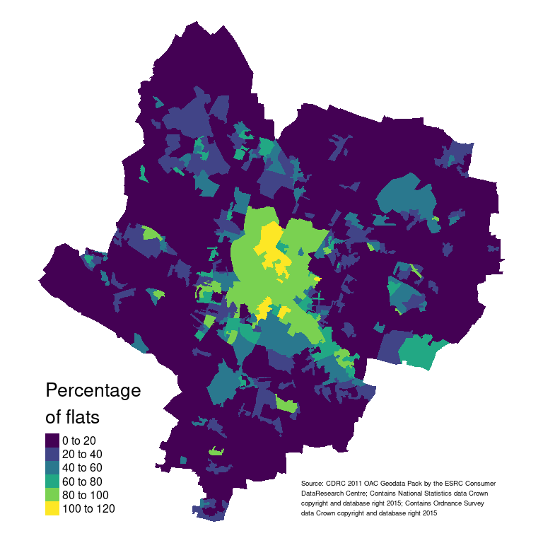
The map above is only demonstrative. The next semester’s module GY7707 Geospatial Data Analytics will cover spatial data handling, analysis and mapping in R in detail. If you want to replicate the map above, you need download the Census Residential Data Pack 2011 for Leicester from the Consumer Data Research Centre (requires to set up an account) and use the code below after having unzipped the downloaded file.
# Read the Leicester 2011 OAC dataset from the csv file
leicester_2011OAC <-
  read_csv("2011_OAC_Raw_uVariables_Leicester.csv")

# Load the shapefile data
# using the library sf
# https://r-spatial.github.io/sf/
library(sf)
leic_2011OAC_shp <-
  read_sf("data/Census_Residential_Data_Pack_2011/Local_Authority_Districts/E06000016/shapefiles/E06000016.shp")

# Create the map
# using the library tmap
# https://r-tmap.github.io/tmap/
library(tmap)
leic_2011OAC_shp %>%
  # Join shapefile and 2011 OAC data
  left_join(
    leicester_2011OAC,
    by = c("oa_code" = "OA11CD")
  ) %>%
  # Calculate percentages
  mutate(perc_flats = (u089/Total_Dwellings)*100) %>%
  # Create the map
  tm_shape() +
  # Define the choropleth aesthetic
  tm_polygons(
    "perc_flats",
    title = "Percentage\nof flats",
    palette = "viridis",
    legend.show = TRUE,
    border.alpha = 0
  ) +
  # Define the layout
  tm_layout(
    frame = FALSE,
    legend.title.size=1,
    legend.text.size = 0.5,
    legend.position = c("left","bottom")
  ) +
  # Don't forget the appropriate attribution
  tm_credits(
    "Source: CDRC 2011 OAC Geodata Pack by the ESRC Consumer\nDataResearch Centre; Contains National Statistics data Crown\ncopyright and database right 2015; Contains Ordnance Survey\ndata Crown copyright and database right 2015",
    size = 0.3,
    position = c("right", "bottom")
  )
The dataset used to create the 2011 Output Area Classification (2011OAC) contains two variables that might help explore this issue. These data are not very current anymore, and they are not the values we might collect if we were to conduct a fresh survey for this specific study. However, they can still provide some insight.
-
u089: count of flats per Output Area (OA). The statistical unit for this variable isHousehold_Spaces. As OAs vary in size and composition, we can useTotal_Household_Spacesto calculate the percentage of flats per OA, which is a more stable measure.perc_flats = (u089 / Total_Household_Spaces) * 100
-
u118: 2 or more cars or vans in household. The statistical unit for this variable isHousehold. As OAs vary in size and composition, we can useTotal_Householdsto calculate the percentage of households per OA with 2 or more cars or vans, which is a more stable measure.perc_2ormore_cars = (u118 / Total_Households) * 100
The process of transforming variables to be within a certain range (such as a percentage, thus using a [0..100] range, or a [0..1] range) is commonly referred to as normalisation. The process of transforming a variable to have mean zero and standard deviation one (z-scores) is commonly referred to as standardisation. However, note that these terms are sometime used interchangeably.
flats_and_cars <-
  leicester_2011OAC %>%
  mutate(
    perc_flats = (u089 / Total_Household_Spaces) * 100,
    perc_2ormore_cars = (u118 / Total_Households) * 100
  ) %>%
  select(
    OA11CD, supgrpname, supgrpcode,
    perc_flats, perc_2ormore_cars
  )
Plotting the two variables together in a scatterplot reveals a pattern. Indeed, a very low percentage of households living in flats own two or more cars. However, the proportion of households owning two or more cars who live in the suburbs seem to span almost throughout the whole range, from zero to 80%. That seems to indicate some level of negative relationship, but the picture is clearly far less clear-cut as we might have initially assumed. The initial assumption about car ownership for households living in flats seems to hold, but we probably didn’t consider the situation in the suburbs with sufficient care.
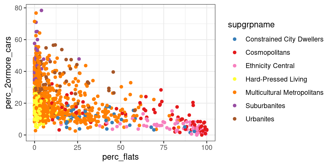
The first step in establishing whether there is a relationship between the two variables is to assess whether they are normally distributed, and thus, which correlation test we should use for the analysis. The scatterplot already seem to suggests that the variables are rather skewed.
As there are 969 OAs in Leicester, we can set the significance threshold to 0.01. The results of the shapiro.test functions below show that neither of the two variables are normally distributed. Transforming the variables using the inverse hyperbolic sine still does not result in normally distributed variables. Thus, we should discard Pearson’s r as an option to explore the correlation between the two variables.
library(pastecs)

flats_and_cars %>%
  select(perc_flats, perc_2ormore_cars) %>%
  mutate(
    ihs_perc_flats = asinh(perc_flats),
    ihs_perc_2omcars = asinh(perc_2ormore_cars)
  ) %>%
  stat.desc(basic = FALSE, desc = FALSE, norm = TRUE) %>%
kable()| perc_flats | perc_2ormore_cars | ihs_perc_flats | ihs_perc_2omcars | |
|---|---|---|---|---|
| skewness | 1.5621906 | 0.9075026 | -0.0927406 | -0.9460022 |
| skew.2SE | 9.9417094 | 5.7753049 | -0.5901967 | -6.0203149 |
| kurtosis | 1.3282688 | 0.4588571 | -1.1009004 | 1.6988166 |
| kurt.2SE | 4.2308489 | 1.4615680 | -3.5066270 | 5.4111309 |
| normtest.W | 0.7443821 | 0.9328442 | 0.9572430 | 0.9514757 |
| normtest.p | 0.0000000 | 0.0000000 | 0.0000000 | 0.0000000 |
The next step is to assess whether there are ties among the values in the two variables. The code below fist counts the number of cases per value. Then it counts the number of values for which the number of cases is greater than one.
ties_perc_flats <-
  flats_and_cars %>%
  count(perc_flats) %>%
  filter(n > 1) %>%
  # Specify wt = n() to count rows
  # otherwise n is taken as weight
  count(wt = n()) %>%
  pull(n)

ties_perc_2ormore_cars <-
  flats_and_cars %>%
  count(perc_2ormore_cars) %>%
  filter(n > 1) %>%
  # Specify wt = n() to count rows
  # otherwise n is taken as weight
  count(wt = n()) %>%
  pull(n)
The variable perc_flats has 127 values with ties and perc_2ormore_cars has 115 values with ties. As such, using Spearman’s rho is not advisable and Kendall’s tau should be used. As above, we can set the significance threshold to 0.01.
Finally, we can run the cor.test function to assess the relationship between the two variables. The code below saves the results of the test to a variable. This allows for two subsequent actions. First, we can show the full results by simply invoking the name of the variable (term used in the programming-related meaning here) in the final line of the code. Second, we can extract and square the estimated value in RMarkdwon in the following paragraph, to show the percentage of shared variance.
flats_and_cars_corKendall <-
  flats_and_cars %$%
  cor.test(
    perc_flats, perc_2ormore_cars,
    method = "kendall"
  )

flats_and_cars_corKendall
##
## Kendall's rank correlation tau
##
## data: perc_flats and perc_2ormore_cars
## z = -19.026, p-value < 2.2e-16
## alternative hypothesis: true tau is not equal to 0
## sample estimates:
## tau
## -0.4094335The percentage of flats and the percentage of households
owning 2 or more cars or vans per OA in the city of Leicester
are negatively related, as the relationship is significant
(`p-value < 0.01`) and the correlation value is negative
(`tau =` -0.41). The two variables share 16.8% of variance. We can thus conclude
that there is a significant but very weak relationship
between the two variables.The percentage of flats and the percentage of households owning 2 or more cars or vans per OA in the city of Leicester are negatively related, as the relationship is significant (p-value < 0.01) and the correlation value is negative (tau = -0.41). The two variables share 16.8% of variance. We can thus conclude that there is a significant but very weak relationship between the two variables.
7.4 Exercise 203.2
See group work exercise, Introduction and Part 1.
by Stef De Sabbata – text licensed under the CC BY-SA 4.0, contains public sector information licensed under the Open Government Licence v3.0, code licensed under the GNU GPL v3.0.