5 Exploratory visualisation
This chapter showcases an exploratory analysis of the distribution of people aged 20 to 24 in Leicester, focusing on the u011 variable from the 2011 Output Area Classification (2011OAC) dataset introduced previous chapters.
Before continuing, create a new R project in RStudio, and upload the 2011_OAC_Raw_uVariables_Leicester.csv file to the project folder. Create new RMarkdown document within that project to replicate the analysis in this document. Once the document is set up, start by adding an R code snipped including the code below, which is loads the 2011OAC dataset and the libraries used for this chapter.
library(tidyverse)
library(knitr)
leicester_2011OAC <- read_csv("2011_OAC_Raw_uVariables_Leicester.csv")
5.1 GGlot2 recap
As seen in the introductory chapter, the ggplot2 library is part of the Tidyverse, and it offers a series of functions for creating graphics declaratively, based on the concepts outlined in the Grammar of Graphics. While the dplyr library offers functionalities that cover data manipulation and variable transformations, the ggplot2 library offers functionalities that allow to specify elements, define guides, and apply scale and coordinate system transformations.
-
Marks can be specified in
ggplot2using thegeom_functions. - The mapping of variables (table columns) to visual variables can be specified in
ggplot2using theaeselement. - Furthermore, the
ggplot2library:- automatically adds all necessary guides using default table column names, and additional functions can be used to overwrite the defaults;
- provides a wide range of
scale_functions that can be used to control the scales of all visual variables; - provides a series of
coord_fucntions that allow transforming the coordinate system.
Check out the ggplot2 reference for all the details about the functions and options discussed below. The The R Graph Gallery also provides a good overview of many of the charts that can be created using R. Healy’s Data Visualization: A Practical Introduction and Kabacoff’s Data Visualization with R provide a more detailed introduction to data visualisation using R and ggplot2.
5.2 Visualising Amounts
We start the analysis by visualising the number of people living in Leicester for each age bracket available in the dataset.
The first step is to summarise the total amounts for each one of the columns from u007 (Age 0 to 4) to u019 (Age 90 and over). The code below uses the dplyr verb across to apply the same summarise function sum across all columns from u007 to u019. The table is then pivoted to longer so that each age bracket is an entity of the table, and the number of people in the age bracket is the attribute to be visualised – if the procedure is unclear, try to execute it step-by-step (summarise first, then pivot) to see the different stages.
Those values can then be represented in a visualisation using a bar chart, which combines the visual variables size (of the bar) and position (on the x-axis, the end of the bar) to encode a numeric value. The function theme_bw is used to use a simple black-and-white theme.
leicester_2011OAC %>%
  summarise(
    across(
      u007:u019,
      sum
    )
  ) %>%
  pivot_longer(
    cols = everything(),
    names_to = "age_bracket",
    values_to = "num_of_people"
  ) %>%
  ggplot(
    aes(
      x = num_of_people,
      y = age_bracket
    )
  ) +
  geom_col() +
  theme_bw()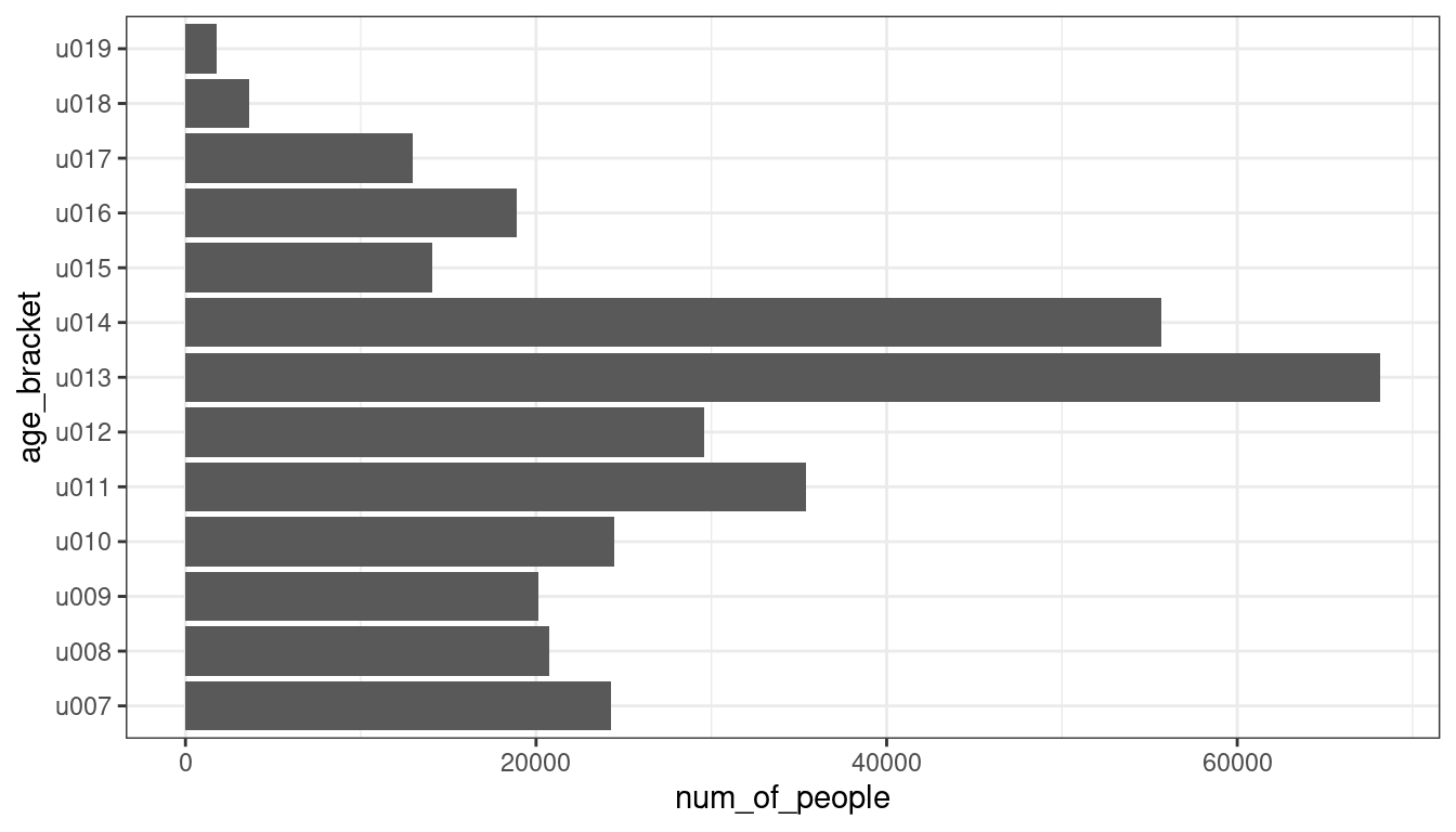
5.3 Visualising Proportions
To better observe how those values compare as proportions of the overall total, the visualisation can be transformed into a stacked bar chart, compounding all area marks into one single bar. The number of people can be moved from the x to the y axis. The age bracket can be moved from the y axis to the fill visual variable.
As there are 13 categories, we can’t use the ColorBrewer schemes in this case (as most palettes count up to 12 colours). Thus, we can use the scale_fill_tableau function from the ggthemes library to select the "Tableau 20" colour palette, which offers 20 clearly distinct colours designed by Tableau, to complete the definition of the colour hue visual variable. The factor(1) value can be used to create a single bar on the x axis.
library(ggthemes)

leicester_2011OAC %>%
  summarise(
    across(
      u007:u019,
      sum
    )
  ) %>%
  pivot_longer(
    cols = everything(),
    names_to = "age_bracket",
    values_to = "num_of_people"
  ) %>%
  ggplot(
    aes(
      x = factor(1),
      y = num_of_people,
      fill = age_bracket
    )
  ) +
  geom_col() +
  scale_fill_tableau("Tableau 20") +
  theme_bw()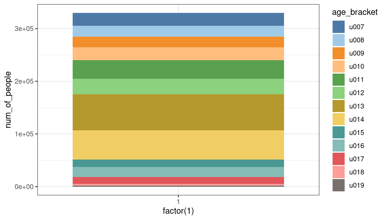
The polar coordinate system transformation coord_polar(theta = "y") can be used to transform the stacked bar chart into a pie chart.
leicester_2011OAC %>%
  summarise(
    across(
      u007:u019,
      sum
    )
  ) %>%
  pivot_longer(
    cols = everything(),
    names_to = "age_bracket",
    values_to = "num_of_people"
  ) %>%
  ggplot(
    aes(
      x = factor(1),
      y = num_of_people,
      fill = age_bracket
    )
  ) +
  geom_col() +
  scale_fill_tableau("Tableau 20") +
  coord_polar(theta = "y") +
  theme_bw()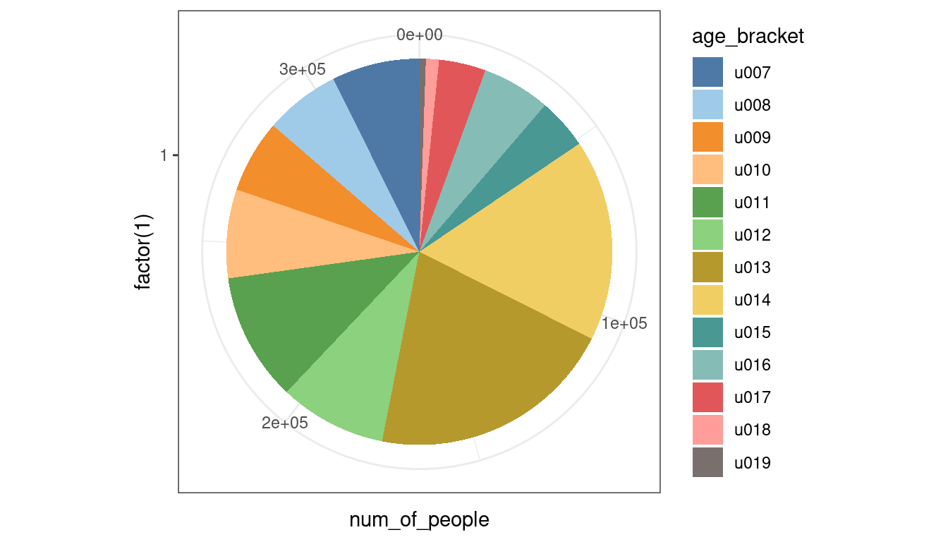
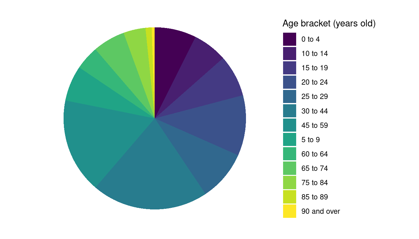
We can then use the theme_minimal theme and set a few of the theme elements to element_blank to clean-up the chart. We can also rename the age brackets columns ahead of the pivot and change the order of the slices using direction = -1 to make the chart readable.
leicester_2011OAC %>%
  summarise(
    across(
      u007:u019,
      sum
    )
  ) %>%
  rename(
    `0 to 4` = u007,
    `5 to 9` = u008,
    `10 to 14` = u009,
    `15 to 19` = u010,
    `20 to 24` = u011,
    `25 to 29` = u012,
    `30 to 44` = u013,
    `45 to 59` = u014,
    `60 to 64` = u015,
    `65 to 74` = u016,
    `75 to 84` = u017,
    `85 to 89` = u018,
    `90 and over` = u019
  ) %>%
  pivot_longer(
    cols = everything(),
    names_to = "age_bracket",
    values_to = "num_of_people"
  ) %>%
  ggplot(
    aes(
      x = factor(1),
      y = num_of_people,
      fill = age_bracket
    )
  ) +
  geom_col() +
  scale_fill_tableau("Tableau 20") +
  coord_polar(theta = "y", direction = -1) +
  labs(
    fill = "Age bracket (years old)"
  ) +
  theme_minimal() +
  theme(
    panel.border = element_blank(),
    panel.grid = element_blank(),
    axis.ticks = element_blank(),
    axis.title.x = element_blank(),
    axis.text.x = element_blank(),
    axis.title.y = element_blank(),
    axis.text.y = element_blank()
  )
As the categories in this case have a clear order, the visual variable colour value could be used instead of colour hue, thus using a series of shared of the same hue. However, as there are 13 categories, again we can’t use the ColorBrewer schemes. Thus, the example below uses one of the viridis colour palettes.
leicester_2011OAC %>%
  summarise(
    across(
      u007:u019,
      sum
    )
  ) %>%
  rename(
    `0 to 4` = u007,
    `5 to 9` = u008,
    `10 to 14` = u009,
    `15 to 19` = u010,
    `20 to 24` = u011,
    `25 to 29` = u012,
    `30 to 44` = u013,
    `45 to 59` = u014,
    `60 to 64` = u015,
    `65 to 74` = u016,
    `75 to 84` = u017,
    `85 to 89` = u018,
    `90 and over` = u019
  ) %>%
  pivot_longer(
    cols = everything(),
    names_to = "age_bracket",
    values_to = "num_of_people"
  ) %>%
  ggplot(
    aes(
      x = factor(1),
      y = num_of_people,
      fill = age_bracket
    )
  ) +
  geom_col() +
  scale_fill_viridis_d() +
  coord_polar(theta = "y", direction = -1) +
  labs(
    fill = "Age bracket (years old)"
  ) +
  theme_minimal() +
  theme(
    panel.border = element_blank(),
    panel.grid = element_blank(),
    axis.ticks = element_blank(),
    axis.title.x = element_blank(),
    axis.text.x = element_blank(),
    axis.title.y = element_blank(),
    axis.text.y = element_blank()
  )
As you can see, creating a pie chart in ggplot2 provides great insight into the nature of visualisations and the possibilities offered by the library, but it can also be quite tricky – see, for instance, Kabacoff’s section on pie chatrs, the ggplot2 Piechart page of the the R Graph Gallery or the ggplot2 pie chart guide by Statistical tools for high-throughput data analysis (STHDA) for further examples.
Self-test question: which one of the two pie charts above do you think is more readable and why?
5.4 Visualising Distributions
A histogram can be used to explore the distribution of the variable u011.
leicester_2011OAC %>%
  ggplot(
    aes(
      x = u011
    )
  ) +
  geom_histogram(binwidth = 5) +
  theme_bw()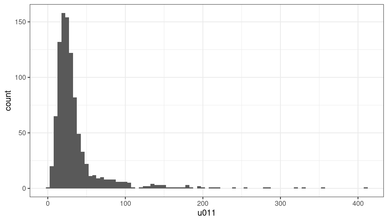
If we aim to explore how that portion of the population is distributed among the different supergroups of the 2011OAC, there are a number of charts that would allow us to visualise that relationship.
For instance, the bar chart above can be enhanced through the use of the visual variable colour and the fill option. The code creates a stacked bar chart where sections of each bar are filled with the colour associated with a 2011OAC supergroup.
leicester_2011OAC %>%
  ggplot(
    aes(
      x = u011,
      fill = fct_reorder(supgrpname, supgrpcode)
    )
  ) +
  geom_histogram(binwidth = 5) +
  ggtitle("Leicester's young adults") +
  labs(
    fill = "2011 Output Area\nClassification\n(supergroups)"
  ) +
  xlab("Residents aged 20 to 24") +
  ylab("Count") +
  scale_fill_manual(
    values = c("#e41a1c", "#f781bf", "#ff7f00", "#a65628", "#984ea3", "#377eb8", "#ffff33")
  ) +
  theme_bw()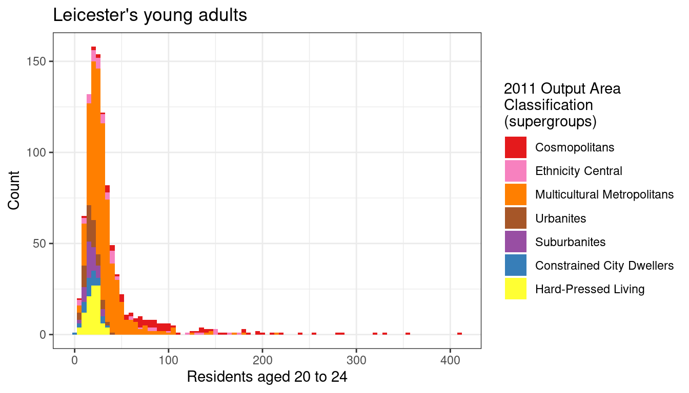
However, the graphic above is not extremely clear. A boxplot and a violin plot created from the same data are shown below. In both cases, the parameter axis.text.x of the function theme is set to element_text(angle = 90, hjust = 1) in order to orientate the labels on the x-axis vertically, as the supergroup names are rather long, and they would overlap one-another if set horizontally on the x-axis. In both cases, the option fig.height of the R snippet in RMarkdown should be set to a higher value (e.g., 5) to allow for sufficient room for the supergroup names.
leicester_2011OAC %>%
  ggplot(
    aes(
      x = fct_reorder(supgrpname, supgrpcode),
      y = u011,
      fill = fct_reorder(supgrpname, supgrpcode)
    )
  ) +
  geom_boxplot() +
  ggtitle("Leicester's young adults") +
  labs(
    fill = "2011 Output Area\nClassification\n(supergroups)"
  ) +
  xlab("2011 Output Area Classification (supergroups)") +
  ylab("Residents aged 20 to 24") +
  scale_fill_manual(
    values = c("#e41a1c", "#f781bf", "#ff7f00", "#a65628", "#984ea3", "#377eb8", "#ffff33")
  ) +
  theme_bw() +
  theme(axis.text.x = element_text(angle = 90, hjust = 1))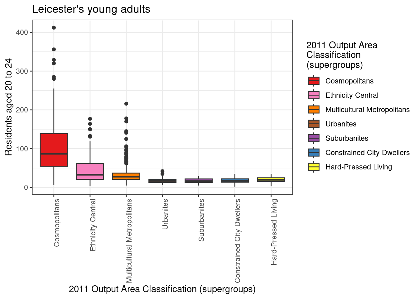
leicester_2011OAC %>%
  ggplot(
    aes(
      x = fct_reorder(supgrpname, supgrpcode),
      y = u011,
      fill = fct_reorder(supgrpname, supgrpcode)
    )
  ) +
  geom_violin() +
  ggtitle("Leicester's young adults") +
  labs(
    fill = "2011 Output Area\nClassification\n(supergroups)"
  ) +
  xlab("2011 Output Area Classification (supergroups)") +
  ylab("Residents aged 20 to 24") +
  scale_fill_manual(
    values = c("#e41a1c", "#f781bf", "#ff7f00", "#a65628", "#984ea3", "#377eb8", "#ffff33")
  ) +
  theme_bw() +
  theme(axis.text.x = element_text(angle = 90, hjust = 1))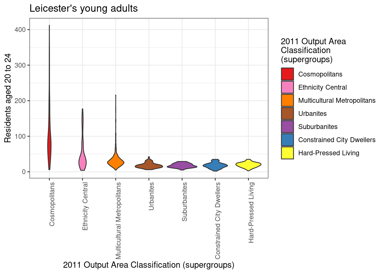
5.5 Visualising Relationships
The first bar chart above seems to illustrate that the distribution might be skewed towards the left, with most values seemingly below 50. However, that tells only part of the story about how people aged 20 to 24 are distributed in Leicester. In fact, each Output Area (OA) has a different total population. So, a higher number of people aged 20 to 24 living in an OA might be simply due to the OA been more populous than others. Thus, the next step is to compare u011 to Total_Population, for instance, through a scatterplot such as the one below.
leicester_2011OAC %>%
  ggplot(
    aes(
      x = Total_Population,
      y = u011,
      colour = fct_reorder(supgrpname, supgrpcode)
    )
  ) +
  geom_point(size = 0.5) +
  ggtitle("Leicester's young adults") +
  labs(
    colour = "2011 Output Area\nClassification\n(supergroups)"
  ) +
  xlab("Total number of residents") +
  ylab("Residents aged 20 to 24") +
  scale_y_log10() +
  scale_colour_brewer(palette = "Set1") +
  scale_colour_manual(
    values = c("#e41a1c", "#f781bf", "#ff7f00", "#a65628", "#984ea3", "#377eb8", "#ffff33")
  ) +
  theme_bw()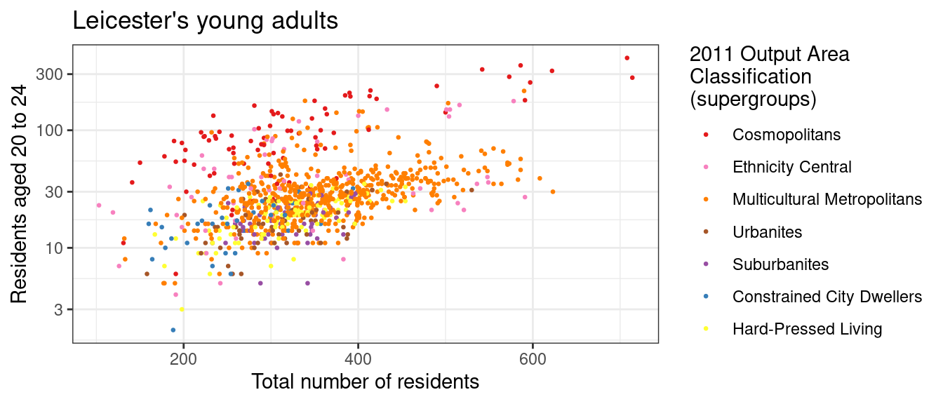
5.6 Exercise 201.1
Open the Leicester_population project used in previous chapters and extend the “Exploring deprivation indices in Leicester” document to include the code necessary to solve the questions below. Use the full list of variable names from the 2011 UK Census used to generate the 2011 OAC that can be found in the file 2011_OAC_Raw_uVariables_Lookup.csv to indetify which columns to use to complete the tasks.
Question 201.1.1: Write a piece of code to create a chart showing the percentage of EU citizens over total population for each decile of the Index of Multiple Deprivations
Question 201.1.2: Write a piece of code to create a chart showing the relationship between the percentage of EU citizens over total population with the related score of the Index of Multiple Deprivations, and illustrating also the 2011 OAC class of each OA.
Question 201.1.3: Write a piece of code to create a chart showing the relationship between the percentage of people aged 65 and above with the related score of the Income Deprivation, and illustrating also the 2011 OAC class of each OA.
Question 201.1.4: What does the graph produced for Question 201.1.3 mean? Write up to 100 words explaining what conclusions can be drawn from the graph – remember that “the larger the score, the more deprived the area”.
Question 201.1.5: Identify the index of multiple deprivation that most closely relate to the percentage of people per OA whose “day-to-day activities limited a lot or a little” based on the “Standardised Illness Ratio”.
by Stef De Sabbata – text licensed under the CC BY-SA 4.0, contains public sector information licensed under the Open Government Licence v3.0, code licensed under the GNU GPL v3.0.